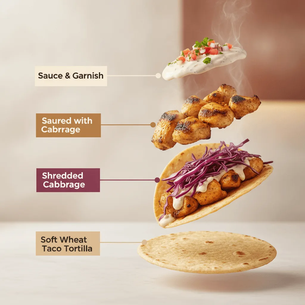
A high-end commercial food photograph of the same two tacos shown in @image_1, preserving their exact structure, fillings, proportions, and arrangement. The camera angle is slightly adjusted to a more flattering three-quarter close-up, enhancing depth and appetite appeal without altering the tacos themselves. Soft cinematic lighting highlights the textures of the tortillas and fillings, with subtle steam and natural sheen to emphasize freshness. The background is replaced with a clean, modern, out-of-focus setting in warm complementary tones that enhance the food without distracting from it. Shallow depth of field, crisp focus on the tacos, rich contrast, natural colors, premium restaurant advertising quality, no added or removed ingredients. Second image: an exploded-view commercial visualization of the same taco, presented as a premium recipe-style breakdown — deconstructed into its visible ingredients, matching the original taco precisely in composition, color, and texture, no additional ingredients. The ingredients are separated and arranged in a clean vertical stack, evenly spaced from bottom to top, floating in place with precise alignment and symmetry (in order from bottom to top: tortilla, vegetables, protein, sauce with garnish), each ingredient visually distinct and clearly readable in shape and texture. Annotations: large bold sans-serif font, high legibility at feed scale, each annotation inside a solid or softly rounded rectangular color block matching the ingredient's color, high-contrast text, thick clean connector lines pointing to each ingredient, no transparency that reduces readability. Background soft, neutral, atmospheric with subtle depth and gentle gradients, inspired by premium food advertising. Overall style clean, modern, appetizing, commercial-ready.