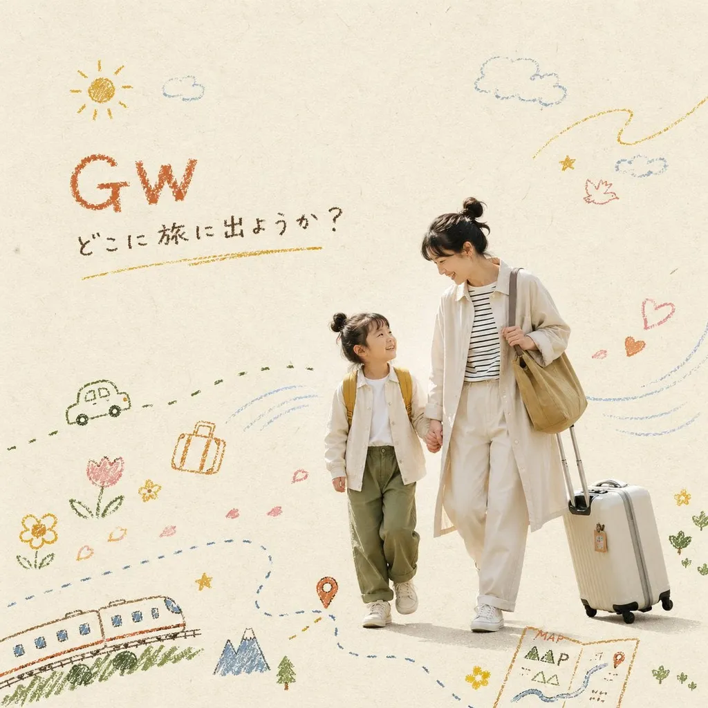
Lifestyle editorial visual blending the main subject cut out from @image_1 with hand-drawn crayon/oil pastel overlays. Use a warm beige kraft paper background with subtle paper texture and light film grain. Natural soft daylight; candid everyday mood that matches the uploaded photo. Composition: 50%+ negative space, asymmetrical, minimal editorial layout. Keep the photo as the hero; the illustration layer should support motion and feeling.
Crayon illustration rules: flat (no shadows or 3D), childlike naive touch, rough and broken lines with visible paper texture; vary pressure for darker and lighter strokes; coverage limited to 30–40% of the frame; link strokes to the subject’s movement (wind, trails, flow). Add simple crayon icons and strokes that symbolize [Spring picnic]: wind lines, sun, clouds, flowers, hearts, stars, zigzag paths; use coarse strokes to suggest air and movement.
Title text: place "[Spring Picnic]" as hand-written crayon lettering in the top-left or top-right negative space; slightly imperfect, textured and grainy; earth-tone color (terracotta, mustard, or dark brown); small size; no decorative frame, flat.
Color palette: warm earth tones and soft muted colors (terracotta, mustard, olive, milk tea, pale blue). Style: picture-book warmth × Nordic minimal × premium lifestyle advertising. High resolution, commercial quality.