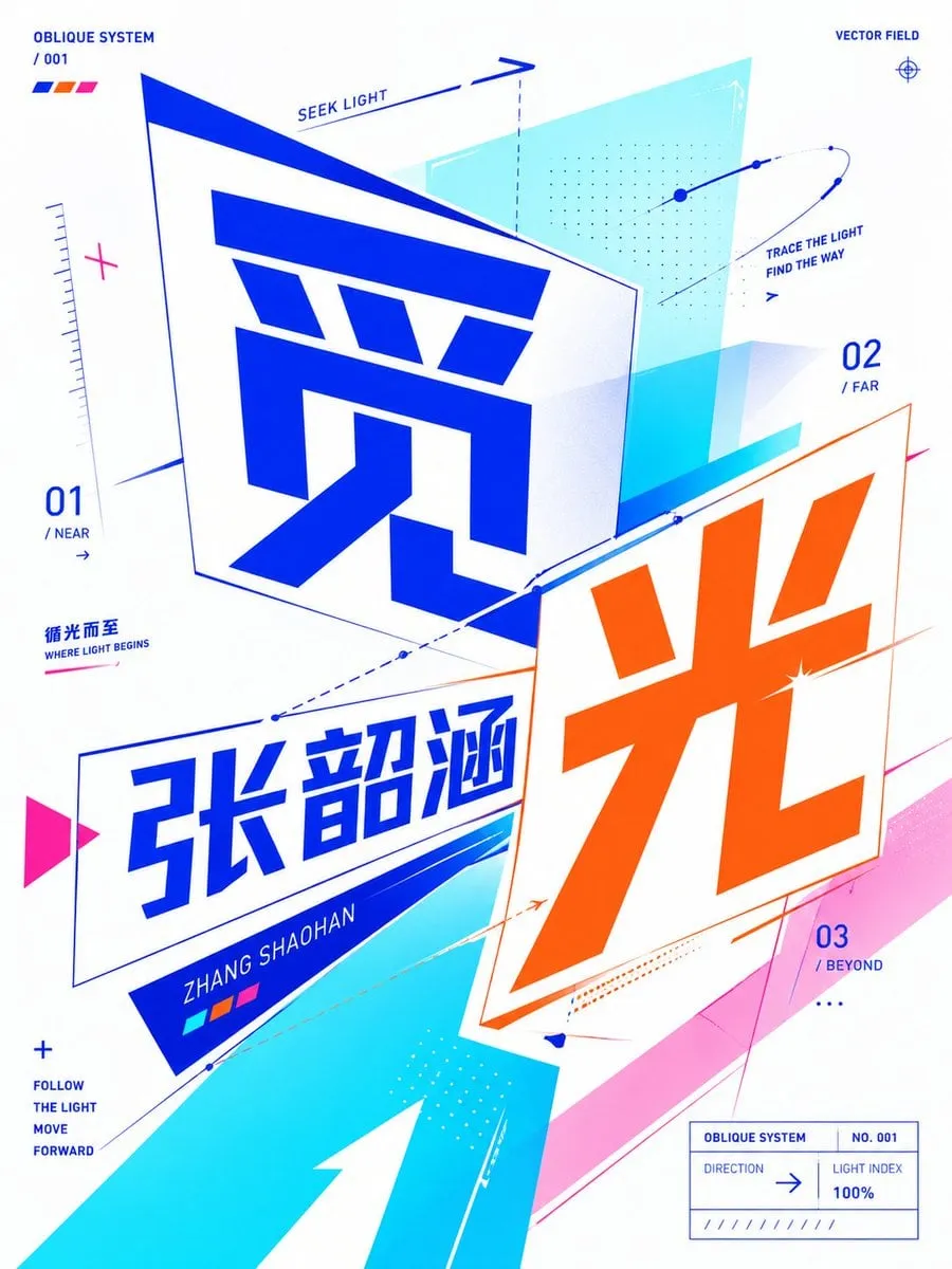
Based on the user's input of [core text / word / phrase / short sentence / letter], create a highly polished "Oblique Planar Perspective Typographic Poster".
User input: [Theme Text];
Text language: [Chinese / English / Mixed Chinese and English];
Optional supplementary context: Creato;
Optional emotional tendency: Creato;
Optional forbidden elements: Creato.
This is not a regular illustration, nor a text effect poster with simply enlarged text, nor traditional front-facing flat typographic layout. Instead, it is a modern, experimental typographic poster with "text as the primary visual core". The overall design must utilize "Oblique Planar Perspective Typography": text should not be perfectly flat on a front-facing plane, but rather appear as if placed on two-dimensional planes with varying tilt angles. Through oblique baselines, perspective compression, plane deflection, angular cuts, staggered compositions, vector pointing, directional lines, semi-transparent geometric planes, and modular color blocks, collectively establish a typographic composition effect that "remains flat design, but possesses a clear sense of angle, spatial direction, visual tension, and vector relationships."
First, truly understand the literal meaning, emotional tone, hidden symbolism, cultural associations, psychological feelings, and semantic tension of the user's input content. Then, translate this understanding into a typographic poster system with "directionality, oblique relationships, planar perspective, and visual confrontation / connection relationships". If the theme is emotional, emphasize expression through distance relationships of oblique text planes, center of gravity shifts, negative space direction, line trends, changes in module density, and color block compression / release. If the theme is action-oriented, emphasize expression through oblique advancement, speed lines, directional arrows, perspective slices, staggered planes, and vector trajectories. If the theme is relationship-oriented, emphasize expression through angular differences, intersections, overlaps, confrontations, enclosures, cuts, and intermediary structures between multiple text subjects, geometric planes, and graphic modules. If the theme is an abstract concept, first find a concise abstract metaphor with potential for visual translation, then construct the image using oblique perspective typography, vector auxiliary systems, partial occlusion, hierarchical offsets, module repetition, and deformed grids.
The overall image must present as a modern, sharp, clear, stylish, experimental, impactful, and visually memorable, highly polished typographic poster. The user's input text must be the primary visual subject and the core content of the entire poster. The text can be horizontally arranged, vertically arranged, split, staggered, grouped, reassembled, partially cropped, partially occluded, nested, tilted, perspective-compressed, obliquely rotated, or even placed separately on two-dimensional planes at different angles, but it must always maintain high legibility and clear readability. The audience must at least distinctly feel that the text is no longer flat on a front-facing plane, but has entered a planar spatial system composed of multiple oblique planes and directional relationships.
Emphasize the following stylistic features: text with an oblique angular sense, a planar perspective sense of near-far diminution, vector relationships in different directions, oblique baselines, auxiliary arrows, geometric facets, modular advancement, partial outlines, data-like annotations, small directory-style supplementary explanations, and a small number of dot matrices and path lines. Different texts or text groups can be placed on different oblique planes, forming perspective differences, directional conflicts, visual dialogue, or tension relationships between them. Graphic elements must be constructed around the text, not as independent decorations; they should support the text, cut the text, enclose the text, extend the text's direction, reinforce the text's oblique momentum, and together with the text, form a complete visual sentence.
For the visual language, adopt the direction of modern graphic design, oblique planar perspective typography, experimental typography, bold typographic composition, flat vector aesthetics, high-contrast graphic layout, contemporary editorial poster, and crisp vector-like precision. Overall, it is not realism, not photography, not a retro literary cover, not an old Bauhaus poster feel, not heavy texture style, not a dark art poster, nor a regular PPT cover. It should be a more contemporary, clearer, sharper, more digital, and design-firm-proposal-like and exhibition-poster-like visual result.
[New Color Scheme Requirements]
The color scheme must be vibrant, clear, bright, vivid, and high-contrast, but do not consistently use blue and orange combinations, nor default to common blue-orange clash schemes. Based on the theme's semantics, emotional tone, and visual metaphor, automatically generate a bolder, more imaginative, and fresher modern high-contrast color scheme. Unconventional combinations, striking colors, strong clashes, warm-cool conflicts, neon effects, digital aesthetics, futuristic feels, or artistic color schemes are allowed, but the overall design must still maintain order, aesthetic control, and a sense of design, without appearing chaotic or out of control.
Prioritize a color organization method of "2 main colors + 1 to 2 high-light accent colors + negative space / structural anchor color". Explore but are not limited to the following directions: fluorescent green + magenta + cool white, bright yellow + violet + black, lime green + deep purple + cyan blue, rose red + cyan green + silver white, cherry red + lake blue + pure white, mint green + bright red + deep blue, fluorescent yellow + peach red + purple, coral orange + cyan blue + white, colorful digital patchwork schemes, etc. For each generation, try to create a unique color memory point; do not repeat a single fixed main color scheme, and do not make the series of works look like the same image with different text.
Text colors should not all be pure black. Depending on the composition, different text subjects can use different high-saturation colors, or a primary and secondary color distribution can be formed within the same large text group. A small amount of dark color is allowed as a structural anchor, but the overall image should prioritize a vibrant, clear, striking, and avant-garde color impression. Colors should serve semantic expression, not just for visual excitement; the audience should feel that the colors are "designed," not randomly stacked.
The composition should be bold, oblique, and possess a sense of advancement and direction, while simultaneously maintaining visual order. It is recommended to use 1 core title subject, 1 oblique planar perspective text system, 1 set of geometric vectors and color block structures, and a small amount of auxiliary annotation information and dot-line symbols. The image needs to retain sufficient negative space to give high-saturation colors and oblique text more breathing room and an exhibition poster feel. A small amount of small text explanations, labels, numbering, English keywords, minimalist subtitles, or short phrases can be added to reinforce the concept, but they must be restrained and not overshadow the main title's visual weight. Auxiliary information can simulate annotation language found in visual identity systems or editorial design, such as short words, parameters, indexes, directional instructions, concept tags, etc.
Typography and layout must be modern, clear, striking, powerful, and somewhat experimental. For Chinese, geometric sans-serifs, modern design-oriented display fonts, condensed or faceted typefaces are suitable; for English, bold grotesk, condensed sans, geometric sans, editorial sans, etc., are suitable. Partial stretching, compression, skewing, perspective distortion, and sliced misalignment are allowed, but do not create actual 3D extruded text, heavy shadows, real 3D modeling, metallic text, glass text, or embossed text. The focus is on "spatial sense within a plane," not "physical three-dimensional solidity."
Graphic elements that can be used include: oblique rectangles, tilted planar frames, triangular cut corners, dot systems, arrows, path lines, thin line auxiliary grids, perspective borders, directional vectors, dot matrix modules, data-like short lines, color block facets, semi-transparent geometric slices, partial circular lines, section labels, small-sized index information, etc. All these elements must serve the theme's semantics and typographic composition and should not be purely decorative.
Please avoid the following issues: do not create a regular front-facing flat typographic poster, do not create a traditional minimalist typographic cover, do not create realistic photography or illustration, do not create heavy 3D text, do not create a retro low-saturation or beige-gray toned poster, do not stack irrelevant graphics, do not over-decorate, do not make the text unreadable, do not make the image messy or cluttered, do not let graphics be disconnected from the theme words, and do not repeatedly default to the same main color scheme.
If suitable, automatically generate a very short subtitle or conceptual phrase to help explain the theme, such as "Between ____ and ____", "The tension of ____", "A state of ____", "Where ____ begins", or generate a more concise Chinese short phrase depending on the Chinese context, but it must remain brief, restrained, and design-oriented.
The final output should be a highly polished, modern, vibrant, high-contrast, flat, sharp, highly experimental, and readable typographic concept poster with an oblique planar perspective typographic composition, a strong sense of design, and a bolder, freer, and more imaginative color scheme that avoids falling into a fixed blue-orange pattern.